Blog
Our Latest Insights
Case Studies (What We Do)
Hits: 6
VB Distillery: Fixing the Small Problems That Stop People Buying
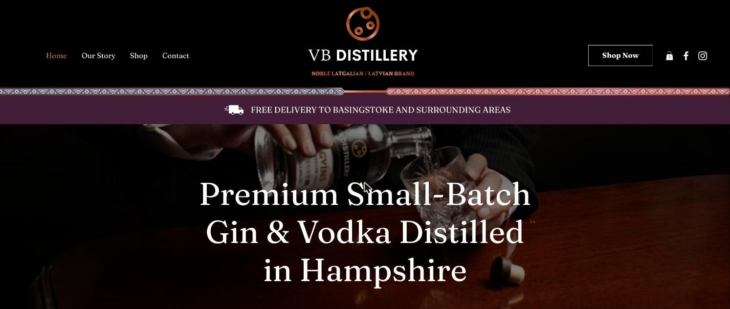
VB Distillery makes premium small-batch gin and vodka in Basingstoke, sold through its own online shop. The website looked good, but small things were getting in the way of people buying: messages that seemed to vanish, confusing payment buttons, emails that did not look professional, and pages that pushed the products too far down the screen. Over three days and just under 12 hours, we found and fixed them one by one.
| Client | VB Distillery Ltd |
|---|---|
| Sector | Craft gin and vodka distillery with an online shop |
| Location | Chineham, Basingstoke, Hampshire |
| Website | vbdistillery.net |
| The job | Find and fix the problems putting customers off: contact form, checkout, payment buttons, customer emails, mobile layout and wording |
| Time taken | About 11 hours 50 minutes over three days, 29 to 31 October 2026 |
Why small problems matter
If something on a shop looks wrong or feels confusing, people do not ring up to ask. They leave and buy somewhere else. This job was not a redesign, new SEO or advertising. It was about going through the website the way a customer would and removing every reason to hesitate.
We set out to make sure that:
- people know their message has arrived
- paying is clear and simple, by card or PayPal
- emails to customers look professional and come from the business
- the website works properly on mobile phones
Problem one: messages that seemed to disappear
When someone sent a message through the Contact page, nothing told them it had arrived. We added a proper thank you page with the owner's photo and a button back to the Shop, and an automatic email that goes out straight away, saying the team normally replies within one working day, with links to Facebook and Instagram.
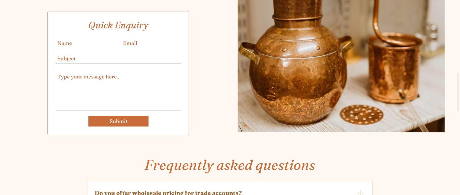
We also put the contact form in a smart box with a copper border and a "Quick Enquiry" heading so it stands out, made the mobile number tap-to-call on phones, fixed a spelling mistake, and changed the Contact page questions so each answer opens when you click it.
Problem two: confusing payment buttons
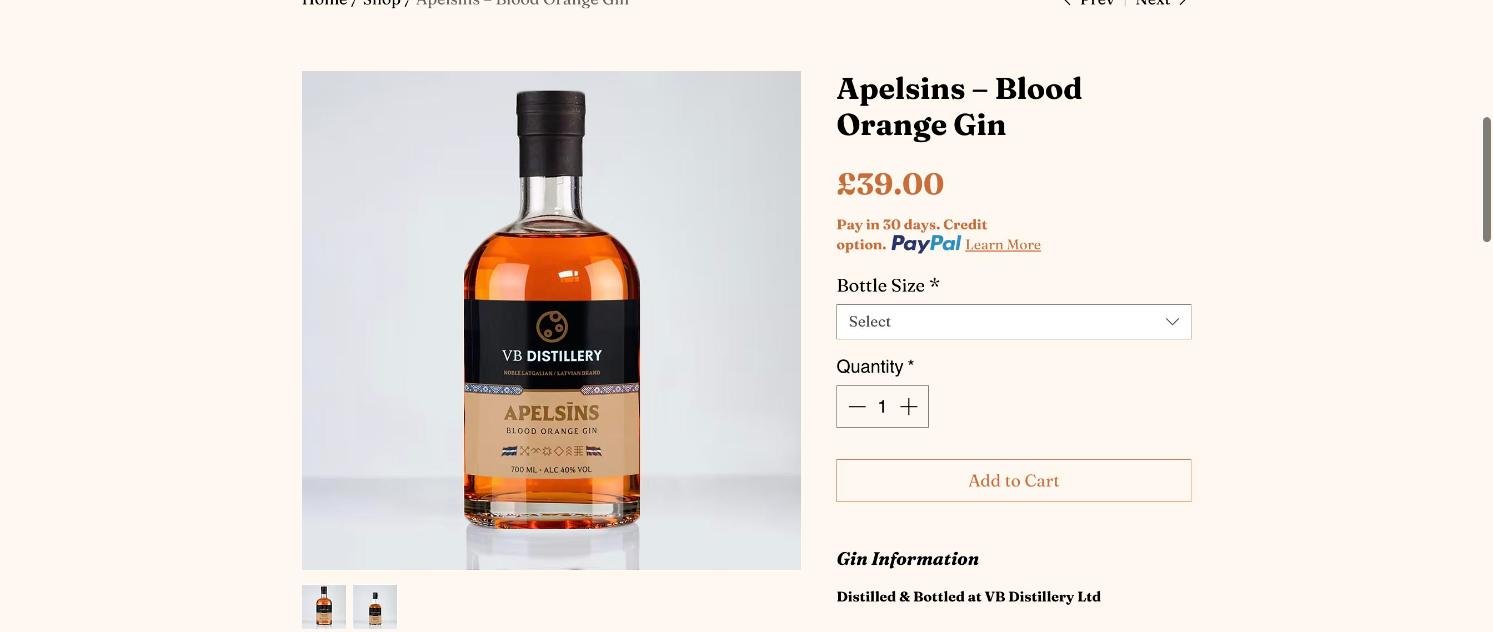
Product pages and the basket showed big yellow PayPal buttons alongside the normal checkout, which made it look as if PayPal was the only way to pay. We checked that card payments through Stripe and PayPal were both working, then removed the extra PayPal buttons so each product has a single, clear "Add to Cart" button, with Visa, Mastercard, Amex and PayPal logos underneath. The basket now has one "Secure Checkout" button and the order page a clear "Thank You for Your Order" heading with a personal line from the owner.
We added a "Payment & Delivery" box to all nine products, explaining card and PayPal payment and the free local delivery, and removed a confusing address box. We also switched on a single reminder email, sent 24 hours after someone leaves items in their basket.
Problem three: emails that did not look right
A customer email had arrived looking wrong. We found out why and set the website's emails to go to the business email address rather than the owner's personal one, ready to connect the business email to the website inbox. The order confirmation email customers receive after paying now carries a personal message from the owner and links to the distillery's Facebook and Instagram.
Problem four: products too far down the page
On the Home and Shop pages there was a large gap above and below the main heading, so visitors had to scroll before they saw a single bottle. We tightened it so the products appear sooner. We also fixed the delivery bar on mobile phones, tidied product names, made the questions on the Home, About, Contact and Shop pages neater, and renamed "About Us" to "Our Story" across the menu, headings, footer and buttons.
The result
VB Distillery now has a shop where every step tells the customer what is happening: their message has arrived, there is one clear way to pay, delivery is explained on every product, and the emails they receive look professional and personal. Nothing dramatic was rebuilt. Lots of small things were put right, and together they remove the reasons people might give up.
Each job was logged with the time it took, so the client could see exactly where the hours went.